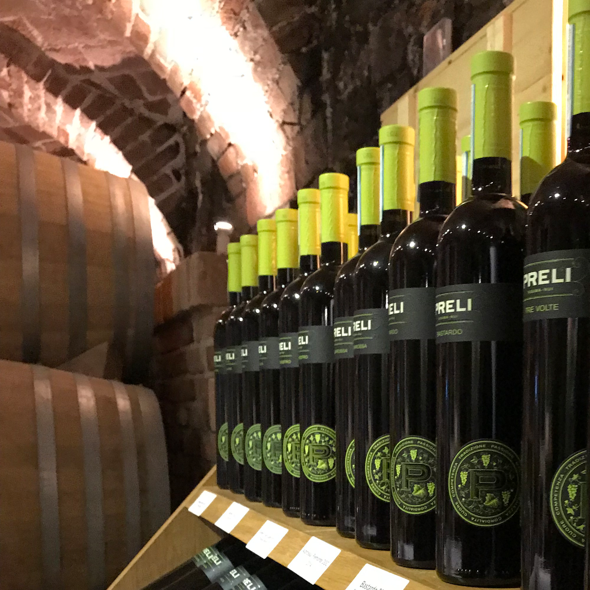
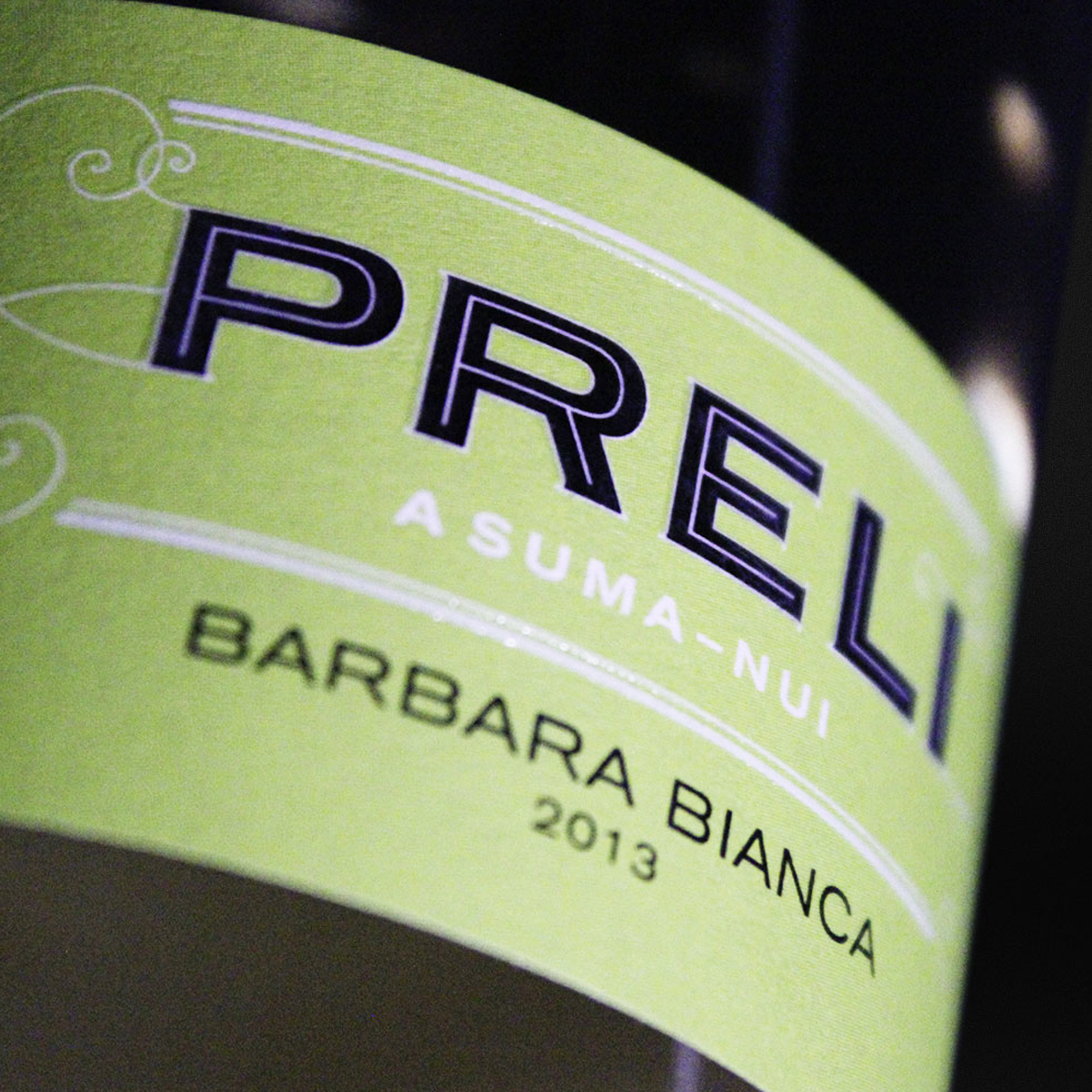
Weingut Preli
Located in Piedmont, Italy, Preli is a privately owned, traditional winery with roots dating back to Roman times.
The aim was to create a brand that would combine the winery’s long history with modernity and reflect the special nature of the wines, particularly the specialisation in local, ancient grape varieties.
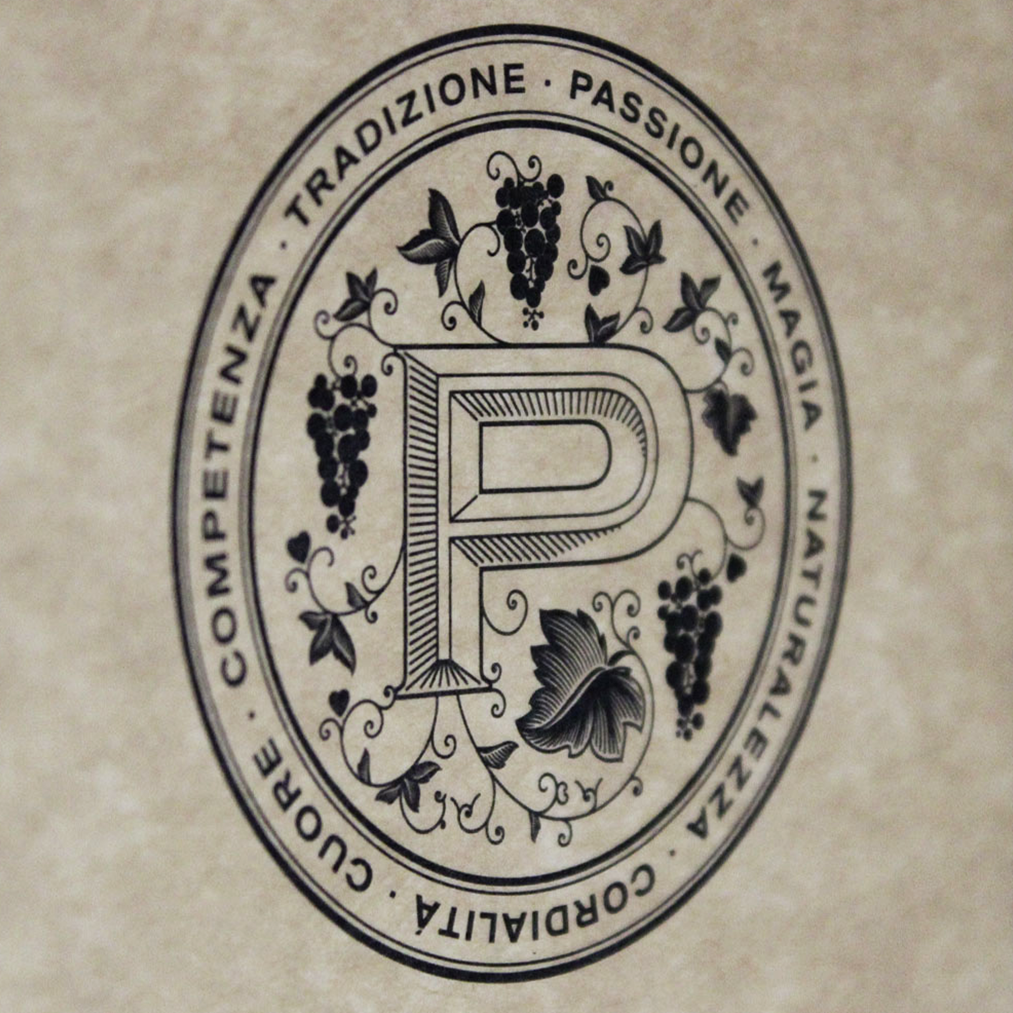
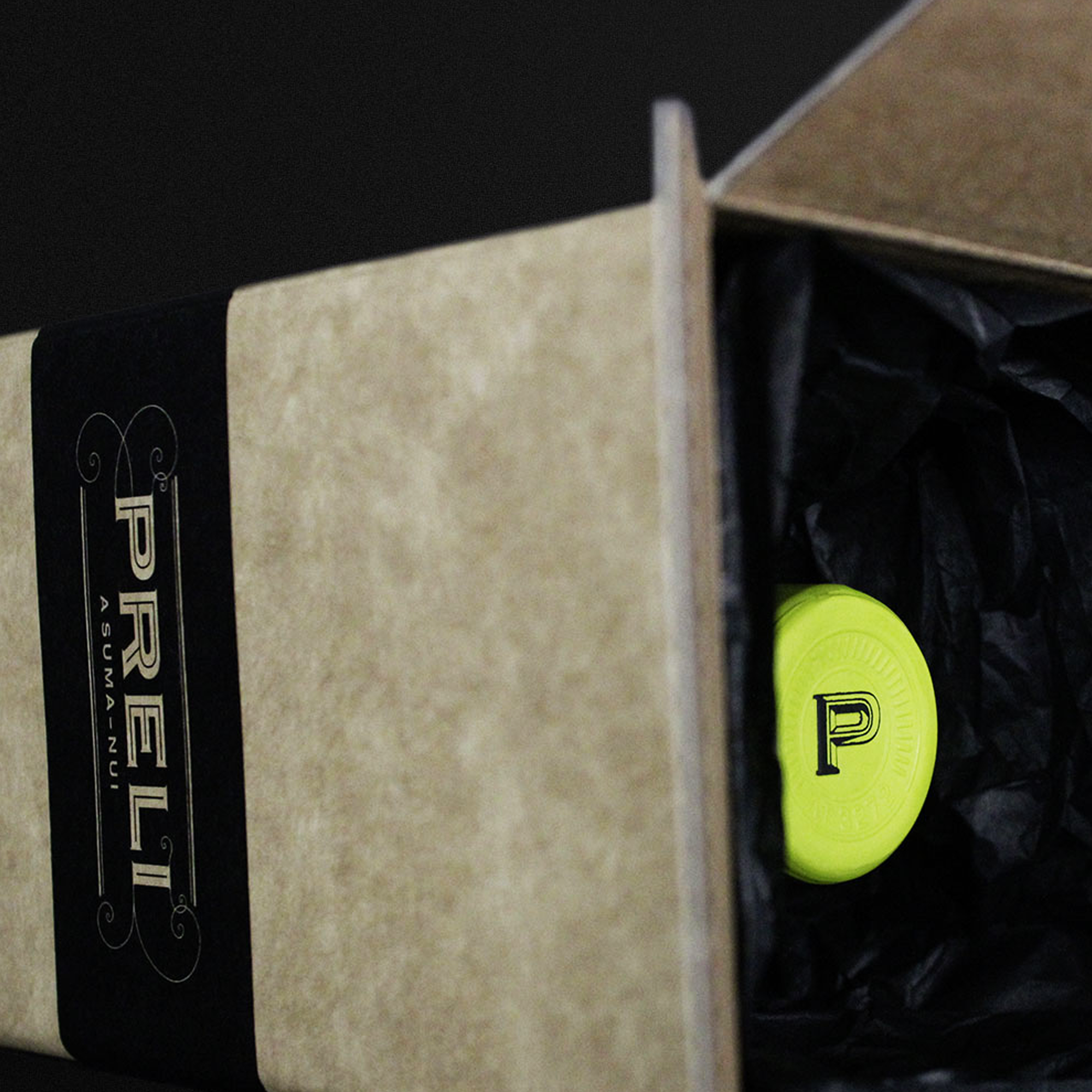
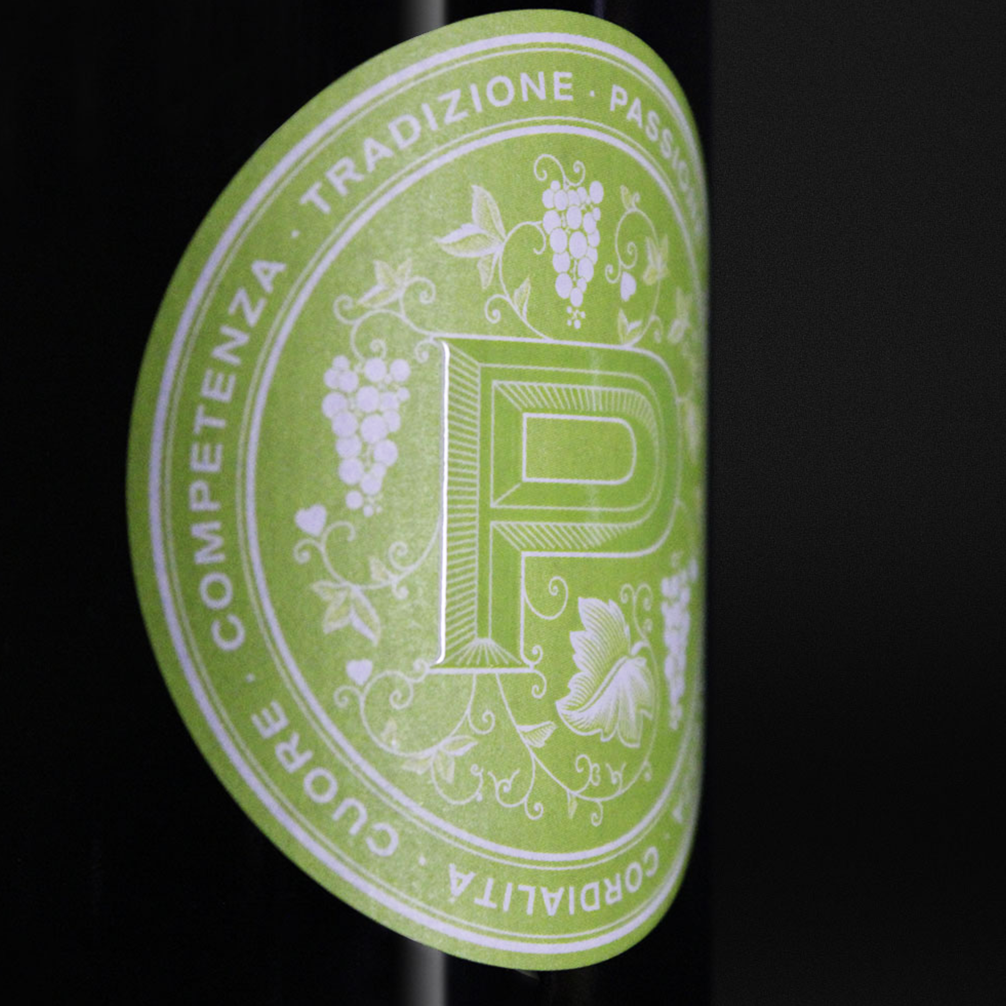
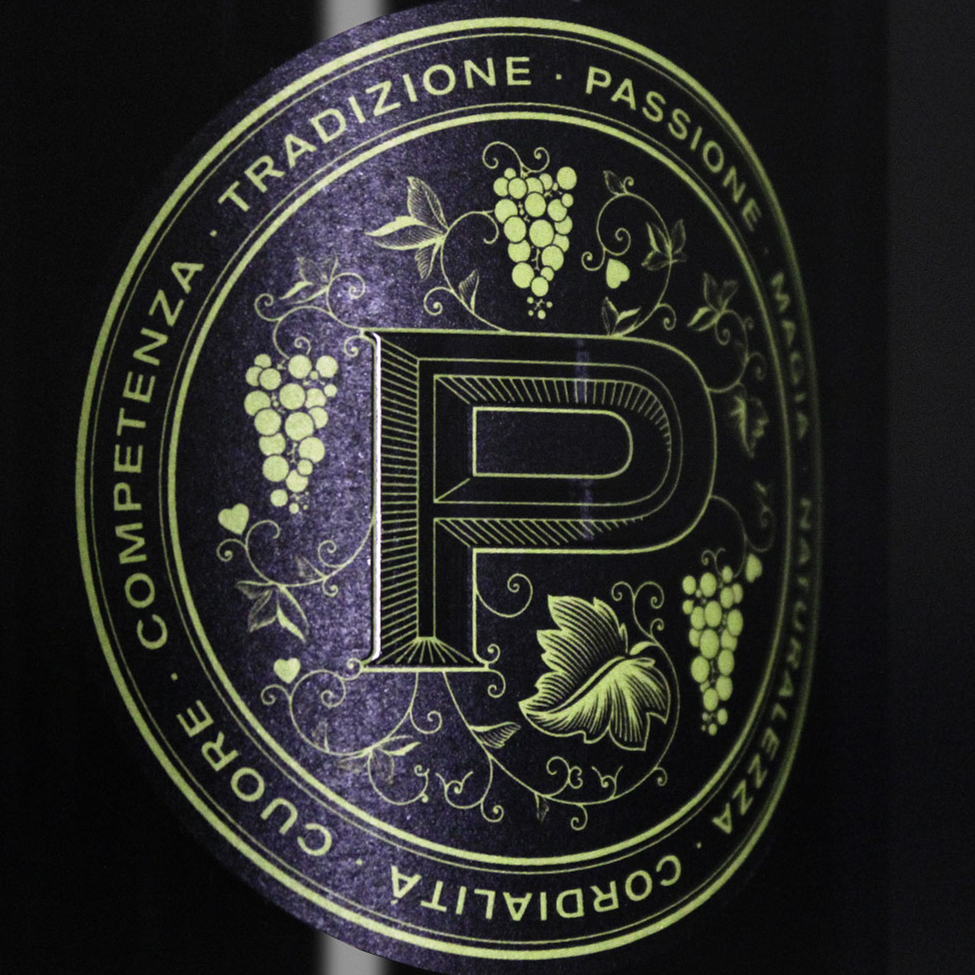
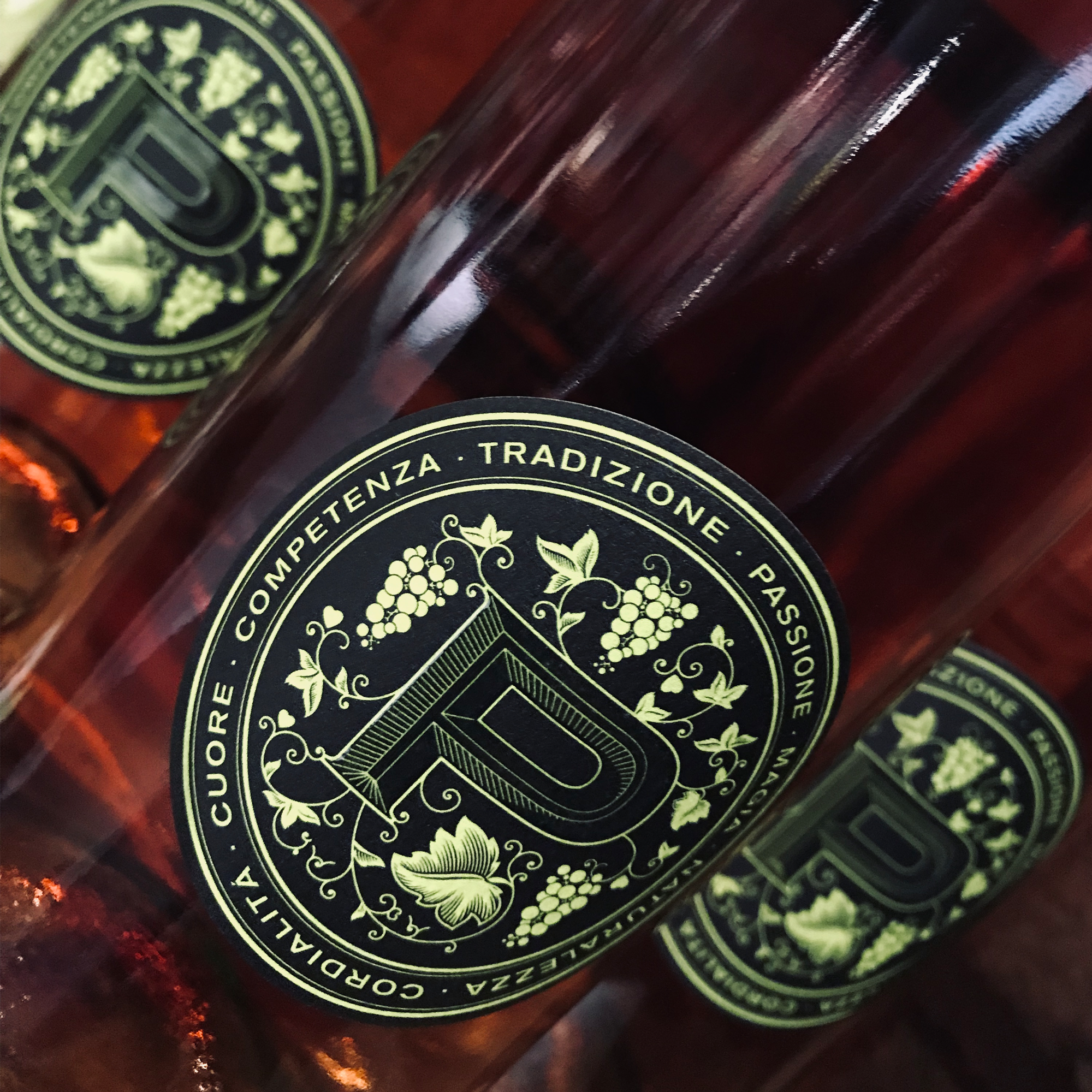
The central idea of the logo is the letter ‚P‘, which forms the centrepiece, from which the vines grow, just as the grapes grow from the soil of Piedmont.
Around the ‚P‘ are the winery’s values, that have characterised it over the centuries: Tradition, Passion, Magic, Naturalness, Warmth and Expertise.
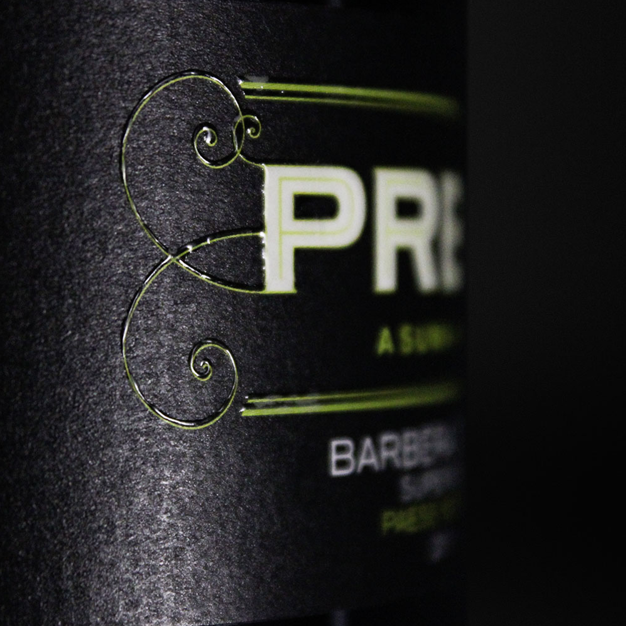
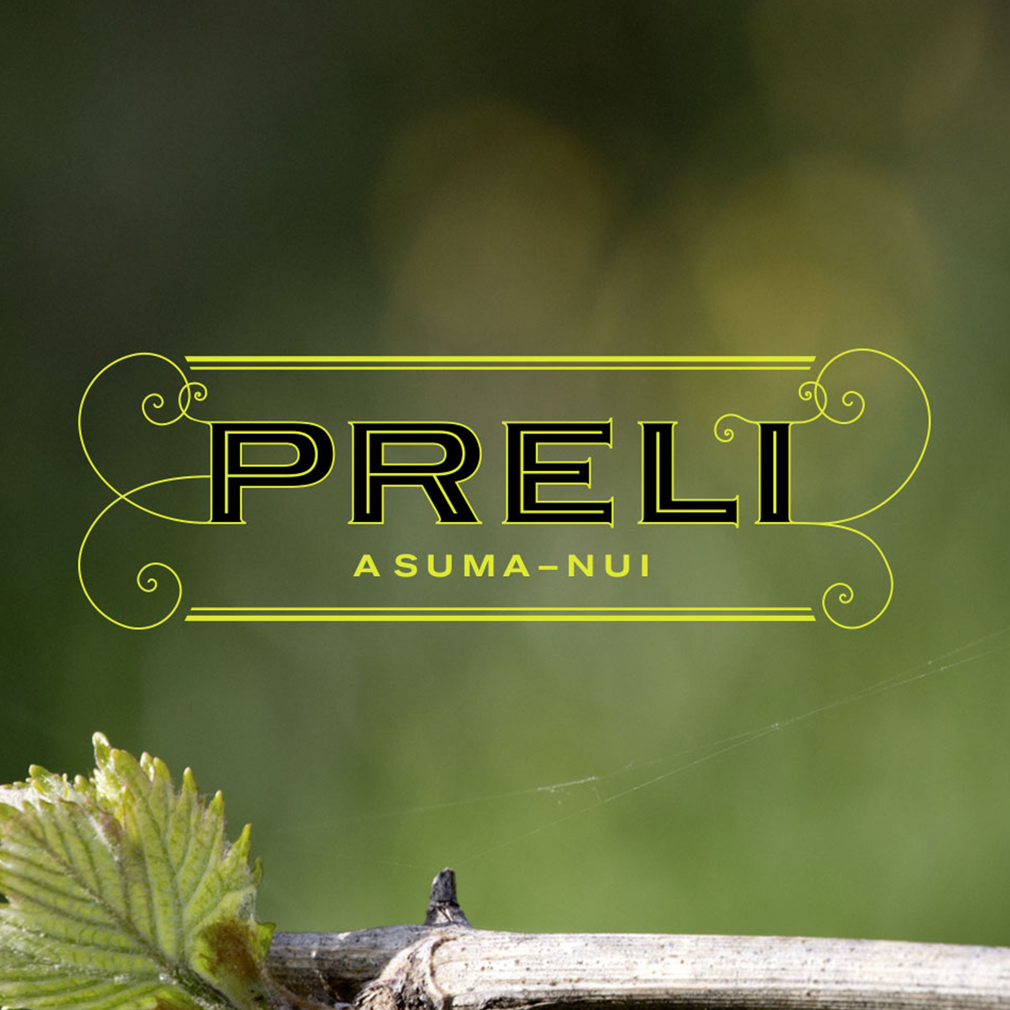
The colour scheme was inspired by my first visit to the vineyard at Easter. At that time, Piedmont was characterised by its special light – mist and refracted light hitting the wet, black earth. The black in the design comes from this impression and represents a deep connection with the earth, while the bright green symbolises the first buds of the vines bursting open and a new beginning.
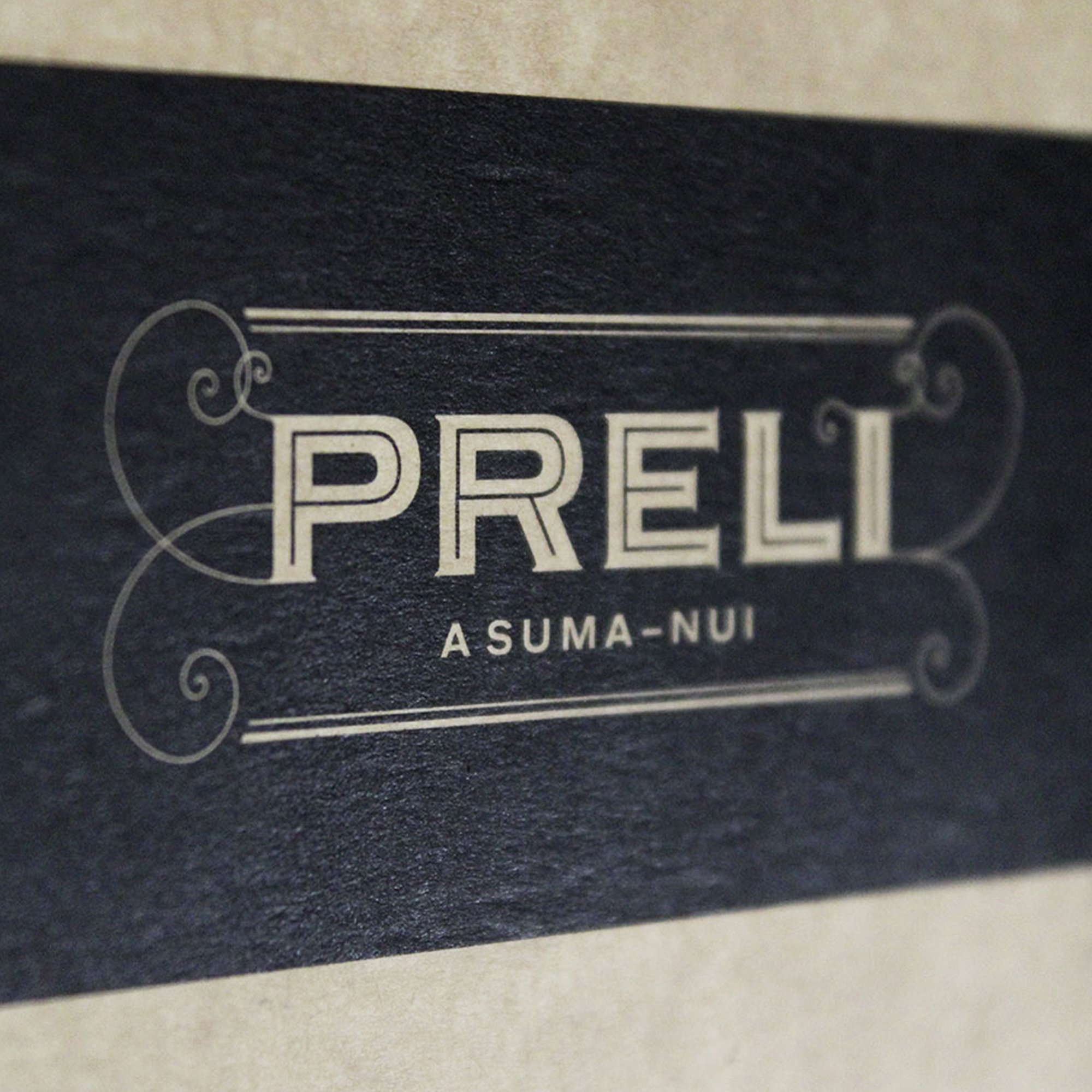
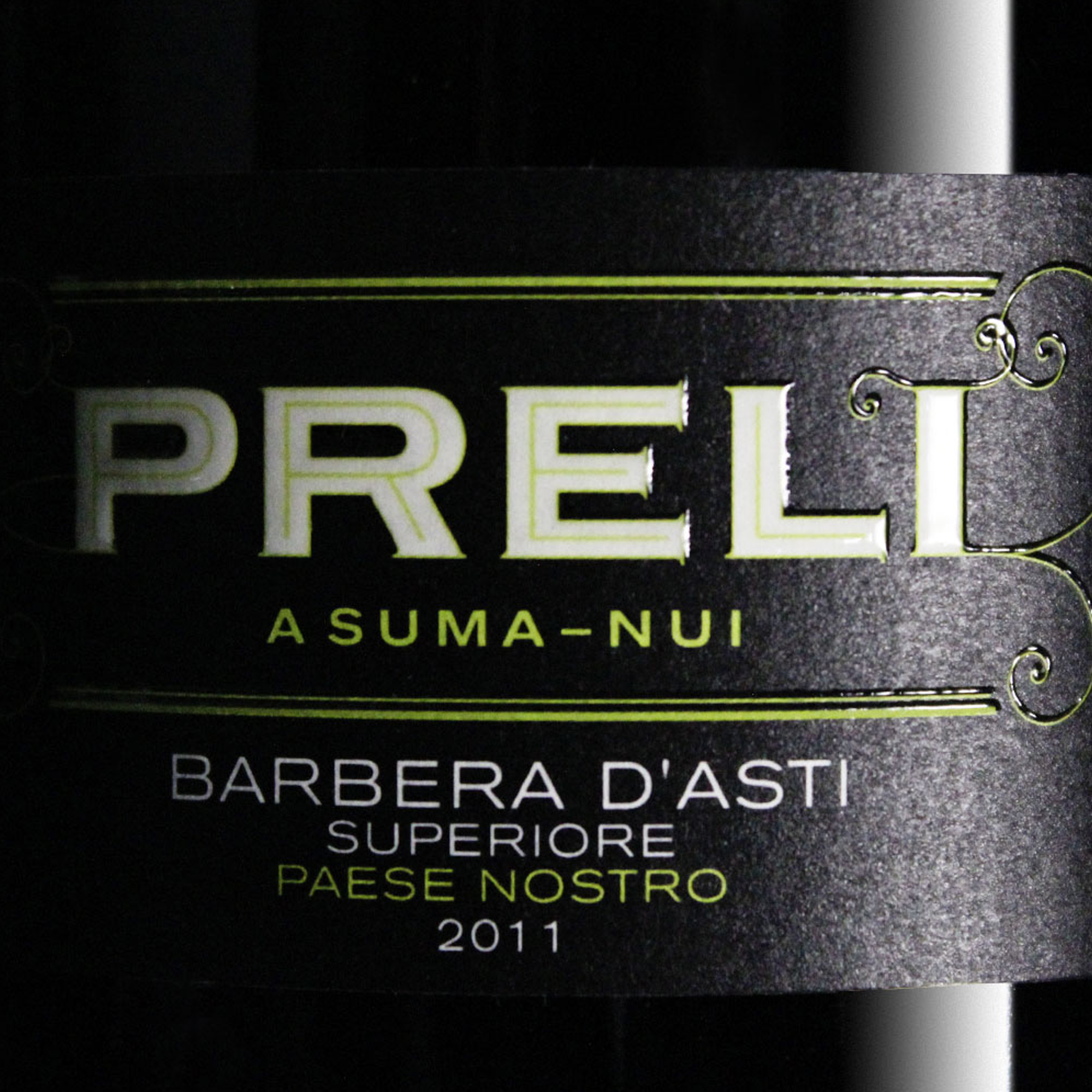
The local dialect expression ‚Asuma Nui‘, which means ‚This is who we are‘, emphasises the authenticity and proud tradition of the Preli winery. The logo reflects not only the winery’s history, but also its deep connection to the region and the land.